CALL CENTERMANAGEMENT SYSTEMREDESIGN
Rebuilding a call center management system designed in 1998 for modern enterprise work.
Chronicall was a complex call center management platform whose interface had accumulated nearly two decades of functionality without a fundamental redesign. The result was a fragmented system of overlapping windows, nested popups, duplicated controls, and workflows that repeatedly removed users from their original task context.
My work went beyond visual modernization. I decomposed the existing functionality, redesigned the information architecture and interaction model, simplified core workflows, and rebuilt the product as a clearer and more scalable enterprise system.
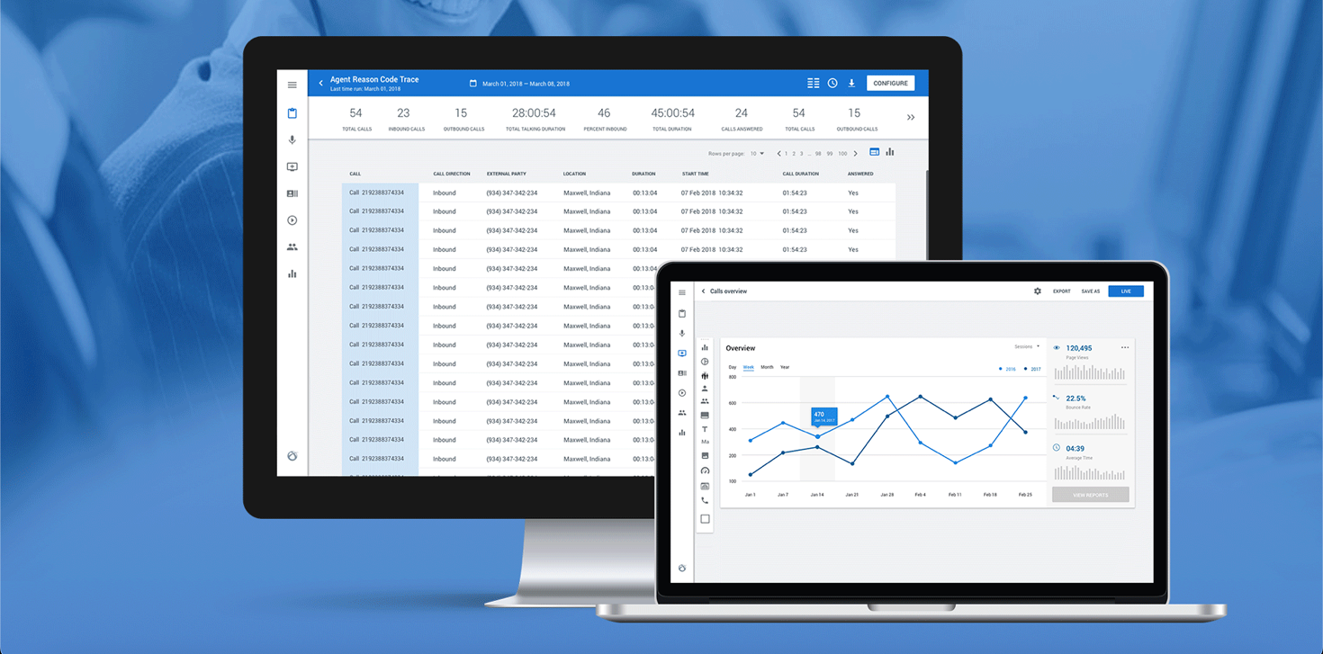
A new interaction architecture for a complex legacy enterprise platform.
The system not only needed
a visual refresh.
It needed to be
decomposed and rebuilt.
The legacy interface reflected years of incremental development. Every new feature had been added as another window, control, or layer rather than being integrated into a coherent task model.
The redesign began by understanding the product beneath the screens: its functions, dependencies, recurring actions, information hierarchy, and the way users moved through operational work.
A working product shaped by decades of accumulated complexity.
Chronicall was functional and feature-rich, but its interaction model no longer matched the realities of modern enterprise work.
A single task could open multiple modal windows on top of one another. Users could end up working through five to seven overlapping popups while the original screen disappeared beneath them.
Information was repeated across windows, related actions were separated, visual hierarchy was weak, and every additional layer increased cognitive load.
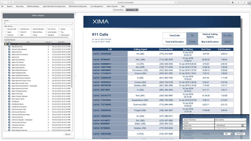
The original interface exposed accumulated product complexity all at once.
- 01Overlapping modal windows
- 02Fragmented task context
- 03Duplicated information
- 04Inconsistent controls
- 05Weak visual hierarchy
- 06High cognitive load
Every action opened another layer.
The legacy system treated individual functions as separate windows. As users progressed through a workflow, each action opened another popup on top of the previous one.
- The original context disappeared
- Users had to remember information from previous layers
- Related actions felt disconnected
- Closing the wrong window could interrupt the task
- Routine workflows became visually and mentally demanding
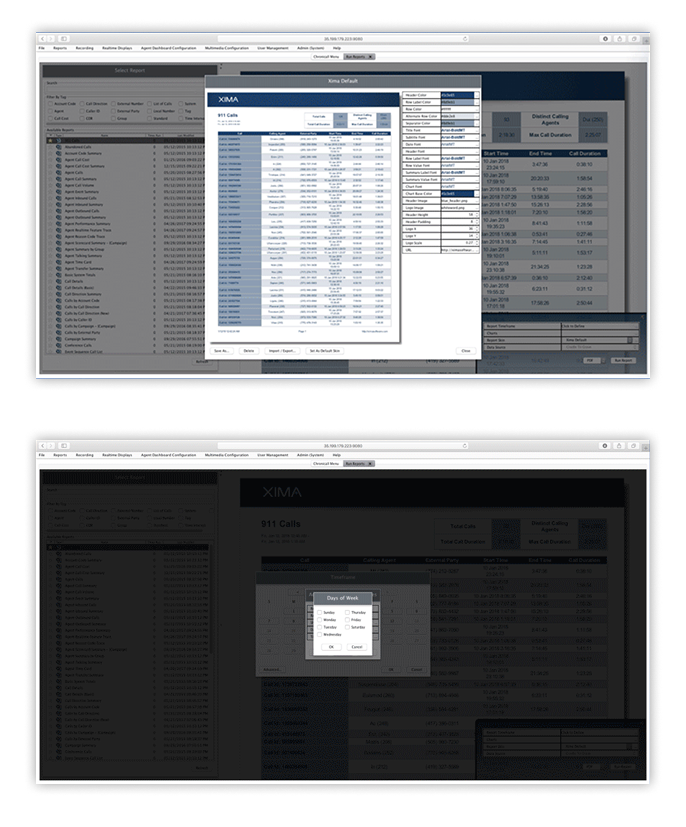
The interface exposed the structure of the software rather than supporting the structure of the user’s task.
Reconstructing the product from functionality to final interface.
I led the UX and interface redesign across the product, beginning with an audit of the legacy system and continuing through functional decomposition, information architecture, workflow redesign, wireframes, interaction patterns, and final visual design.
Before redesigning screens, I mapped the system beneath them.
The existing interface contained years of accumulated functionality. Redesigning individual screens would have preserved the same underlying complexity in a newer visual style.
I reviewed the product as a system: identifying functions, dependencies, repeated controls, recurring actions, and areas where separate windows were actually parts of one continuous task.
This audit helped distinguish essential task context from secondary information and exposed opportunities to consolidate multiple interactions into a single workflow.
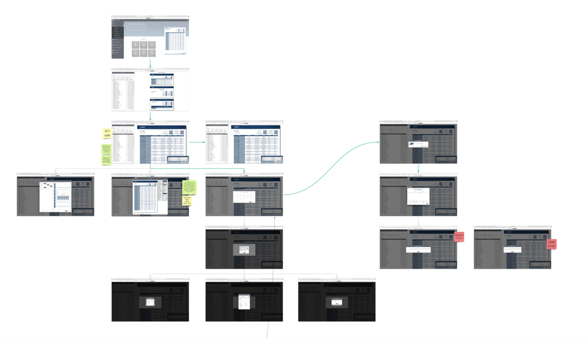
The audit focused on relationships between functions, not only the appearance of individual screens.
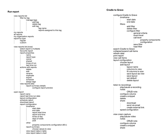
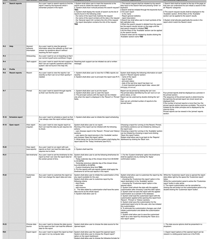
Breaking a monolithic interface into understandable product areas.
I decomposed the platform into core functions, user actions, dependencies, and recurring patterns.
This revealed that many apparently separate windows belonged to the same user task. It also made it possible to reorganize functionality around operational goals rather than the historical structure of the software.
Many separate windows were not separate experiences. They were fragments of the same workflow.
Organizing the product around work, not around accumulated features.
The legacy architecture reflected how functionality had been added over time. The redesigned architecture instead grouped information and actions by the task users were trying to complete.
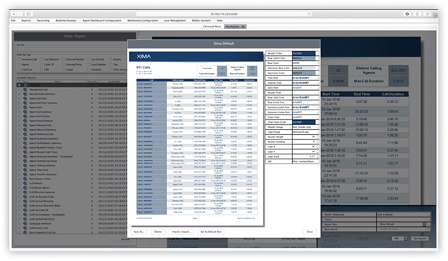
Software structure dictated the workflow.
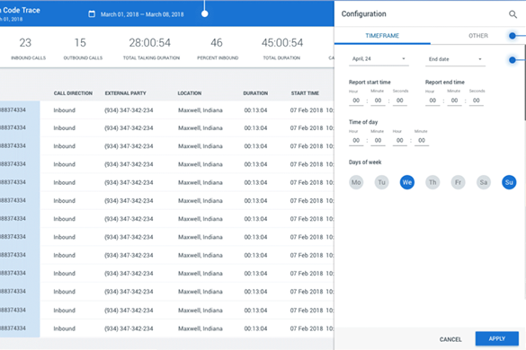
The workflow stayed anchored to the user’s task.
Testing the new architecture before rebuilding the visual system.
The wireframes focused on structure, hierarchy, and interaction behavior rather than visual polish.
- What needed to remain visible throughout a task
- What could appear contextually
- How related actions should be grouped
- How users could move through complex workflows without losing their place
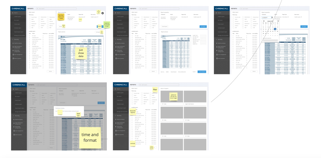
The wireframes translated functional decomposition into a persistent and predictable workspace.
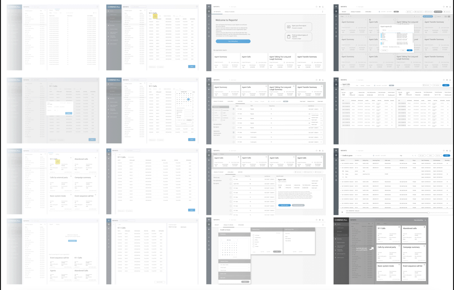
From stacked popups to persistent task context.
The most important architectural change was replacing layers of modal windows with persistent workspaces and contextual side panels.
Instead of covering the main interface, secondary information and actions appeared alongside the current task. Users could review details, make changes, and return to the primary workflow without losing their place.
Every action interrupted the current context.
Related actions remained connected to one workspace.
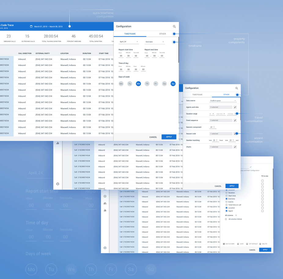
Secondary actions became part of the workflow rather than interruptions to it.
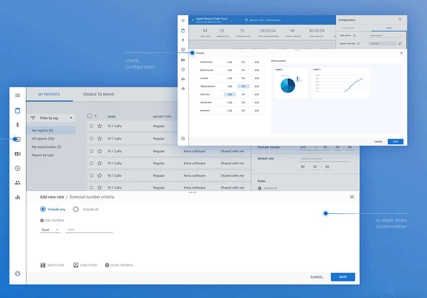
Reducing interaction cost without removing advanced functionality.
The goal was not to make the product less capable. It was to reorganize its capabilities around the way users completed real tasks.
I combined related actions, reduced duplicated controls, clarified hierarchy, and consolidated disconnected steps into more continuous workflows.
The redesign preserved the depth of the enterprise product while revealing complexity progressively instead of presenting every control at once.
Principles that shaped the redesign
Preserve context
Users should always understand where they are, what they are working on, and how a secondary action relates to the main task.
Reveal complexity progressively
Advanced functionality should become visible when relevant instead of competing for attention at all times.
Group by task, not by legacy feature
The product should reflect the user’s operational goal rather than the historical structure of the software.
Use one interaction model consistently
Similar actions should behave predictably across the system.
Modernize structure before styling
A new visual layer cannot solve an outdated interaction architecture.
The final interface was simpler because the system beneath it had been simplified first.
The redesigned Chronicall experience brought operational information, actions, and contextual details into a unified workspace. Dense enterprise functionality remained available, but the interface no longer exposed all of its complexity at once.
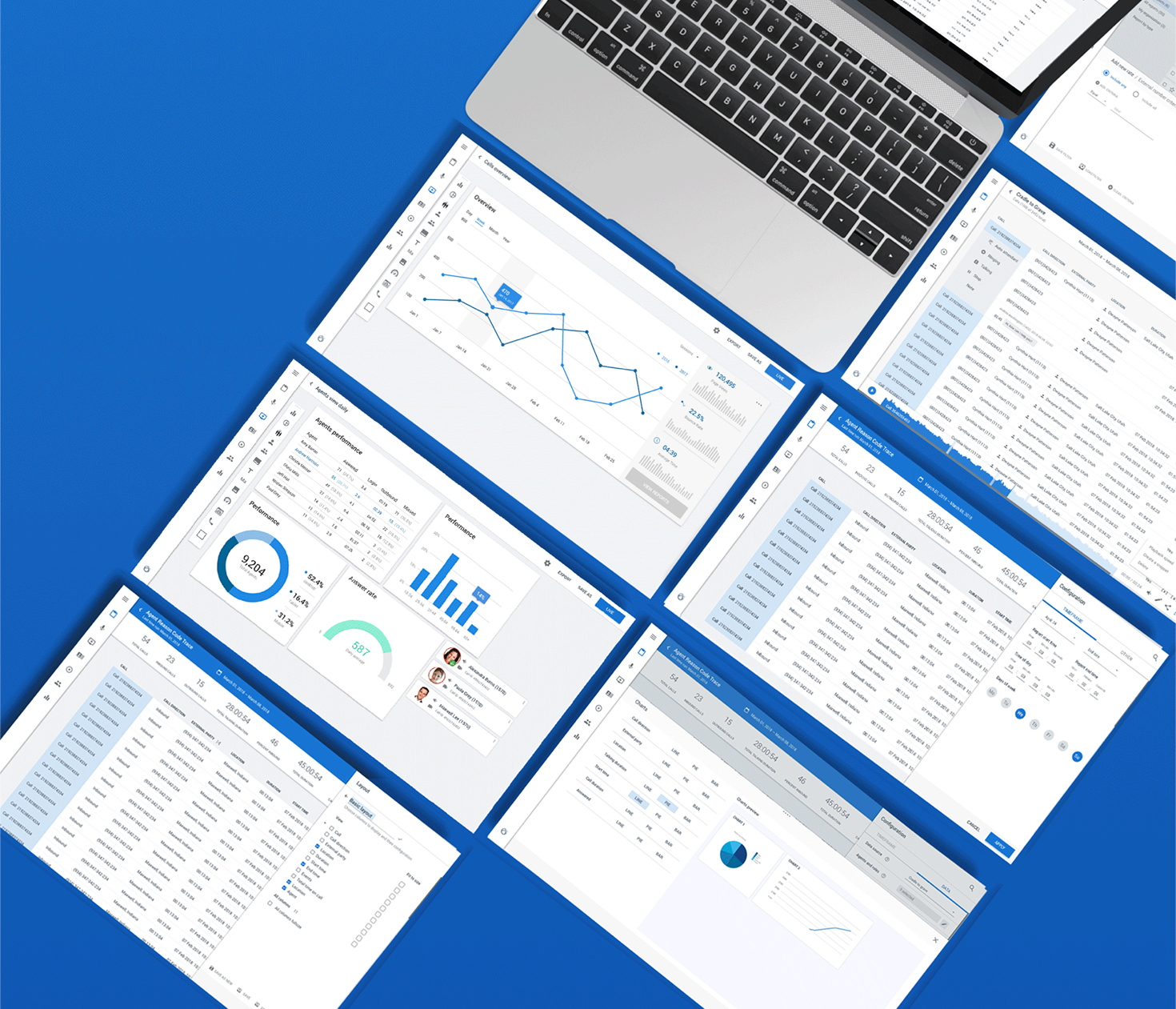
A unified workspace replaced a fragmented collection of windows.
Making dense information easier to scan and act on.
Call center management requires large amounts of operational data. The redesign used hierarchy, grouping, spacing, state patterns, and consistent controls to make dense information easier to navigate.
Primary actions and important status information became visually distinct, while secondary data remained accessible without competing for attention.
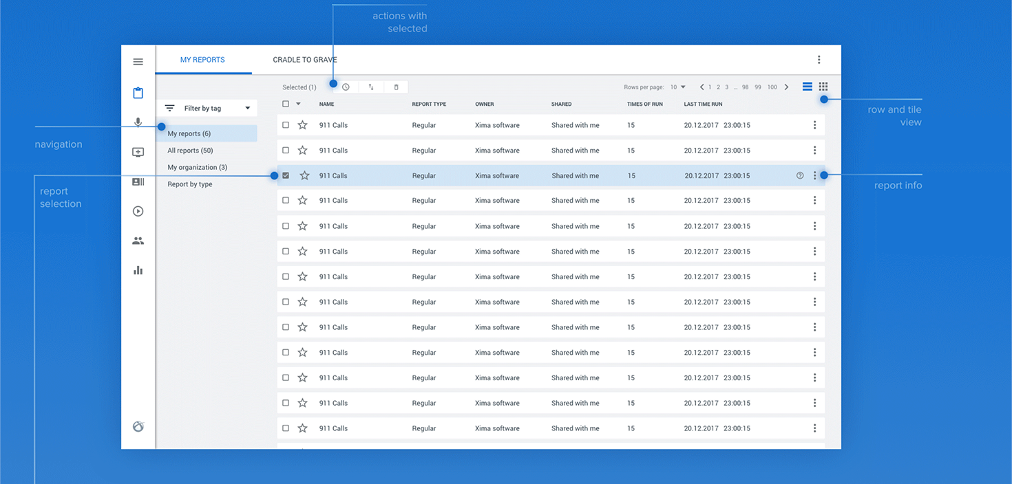
A new interaction architecture for a complex legacy platform.
The Chronicall redesign replaced a fragmented popup-based experience with a clearer, more unified, and more scalable interaction model.
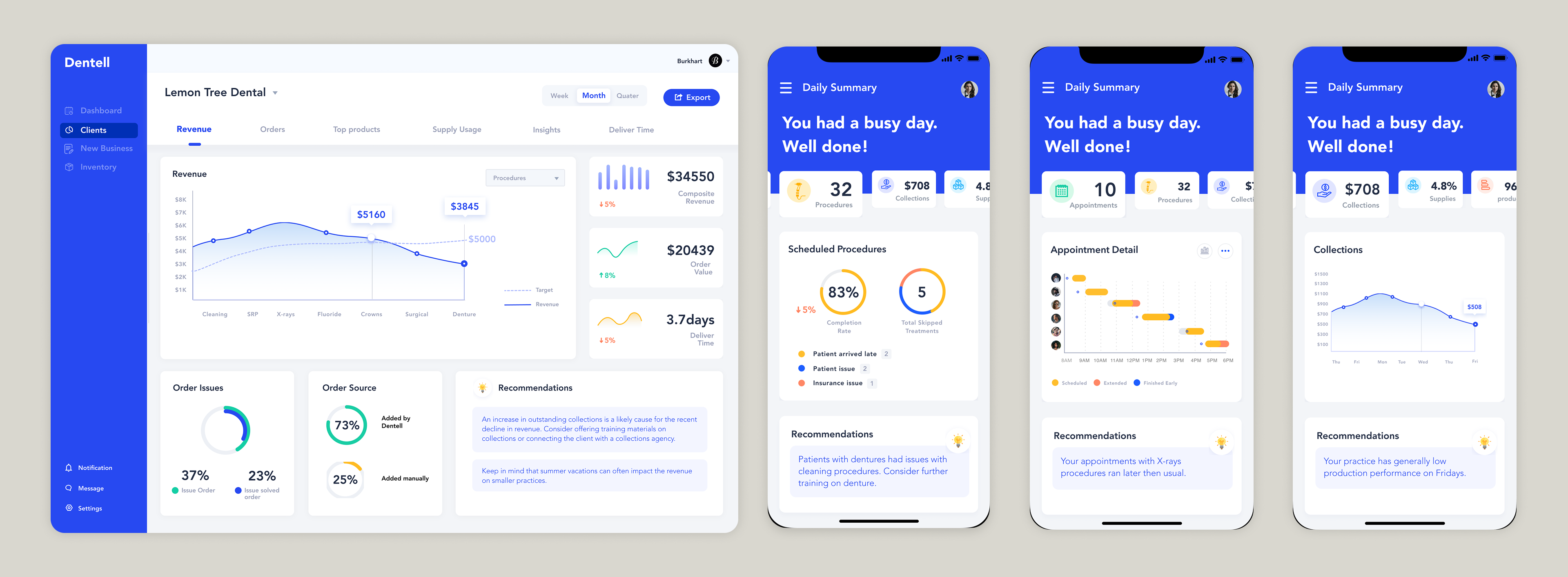
Dentell
Designing a compact desktop and mobile workspace for dental professionals.